GoodbooksToday.com Authors Corner
Kristina.V
I want to share a few book covers with you and give some tips based on these covers.


The first book I’m going to share with you is Evitable Destiny by Izabela Monick
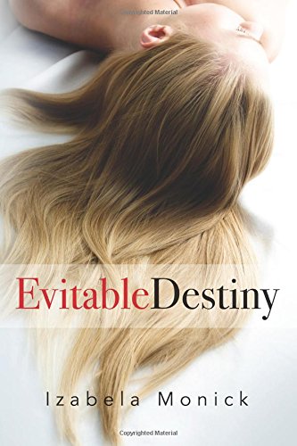
This book cover looks very appealing. It has everything from the color combinations to the picture which leaves us wanting to know more about the book. One of the best features of this book cover is the title. The title looks very attractive with a good color combination of red, black and white and it has a great font. It also works very well with the picture on the background. One of the lesser things about this book cover is that it wouldn’t work well as a profile picture on social media because it wouldn’t be recognizable. A lot of books look similar to this because the formula works so well. All in all though, this is a good book cover.
The second book cover is from a book called Time Management by Kyle Nussen

The title and the background picture work quite well together and it’s very clear what the book is about. The color scheme also looks great. Yet I wouldn’t pick up this book immediately if I saw it. The top part of the book looks very clustered. It does make it more clear what the book is about but the quality of the overall picture goes down because of this. I’m also not sure if it would be recognizable on social media if it were used as a profile picture. Once again, the background title are great but everything surrounding it makes it a bit too clustered for my liking.
Next we have Jaws by Peter Benchley
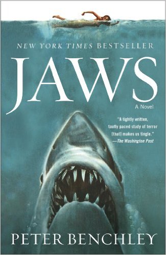
I’m pretty sure we’ve all heard of this one as Steven Spielberg has a movie based on this book. This book cover is great. It covers every necessary aspect. It has a title which catches the attention of people, the picture is very interesting and tells us what the book is about and we have a small review to show us what others think. It also clearly shows that the book has been a bestseller which is very attractive for some readers. This picture would probably be recognized anywhere regardless of how big or small it is. Everything synchronizes perfectly and it’s really a one of a kind cover.
The last book is called Night Chill by Jeff Gunhus
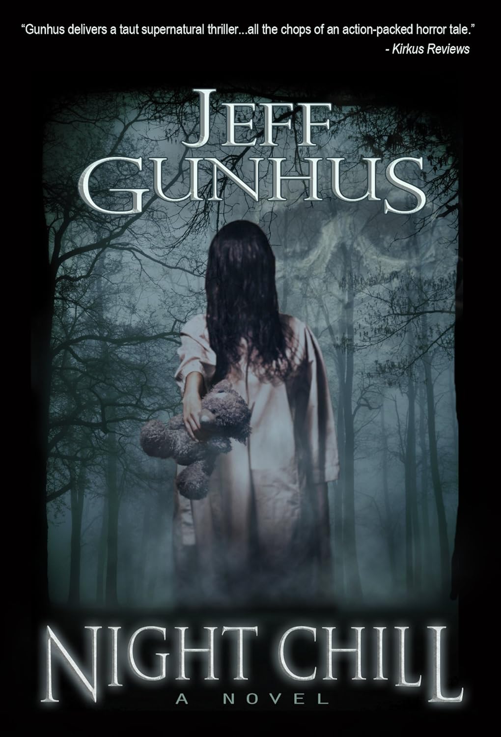
As soon as we look at this cover we know what to expect when we open the book. The title is very nicely done with the letters being on different levels, you might say that this already shows what kind of genre the book will be if you combine it with the title. We once again see a small review at the top of the cover which is nice for those of us that are interested in reading the reviews first. The picture is very clear and immediately attracts those interested in that kind of genre. The picture actually shows more than you initially think. Take a closer look. You see a girl with her teddy bear on a chilly night but upon closer inspection you can also see the shape of a skull in the sky. It’s very intriguing to see but I doubt whether this would be recognizable on social media. The colors are very closely related and therefore wouldn’t portray the image clear enough when reduced in size.
My tips to other writers out there would be as follows:
1. Make sure to have an interesting and eye catching title. Keep color combinations in mind.
2. Make sure the picture is eye catching and portrays a little bit of what we can expect too read.
3. Keep social media in mind. It’s one of the best ways to promote a book nowadays so we want it to be as attractive as possible when put on the internet.
Recommended Author Resources: Book Marketing Services, Free Apps, Book Cover Designers, Email Marketing Software, Website Hosting Discounts, Business Cards…(Visit GBT Author Services Directory)
